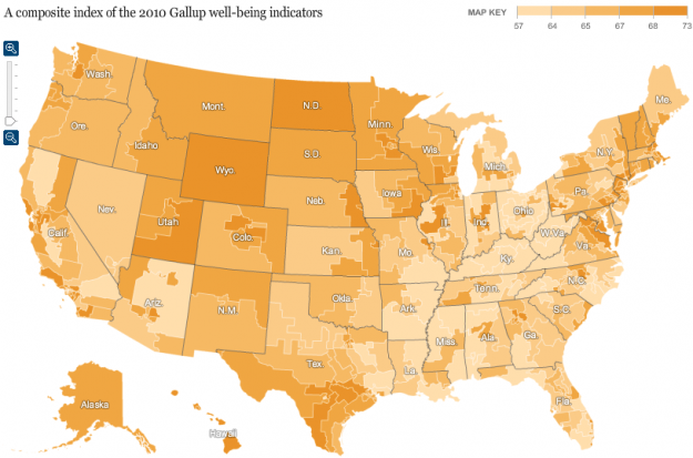
Which US states are the happiest? Unhappiest?
.It’s Gallup data compiled by the New York Times. Hat tip to the amazing Flowing Data. If you like this, you should also check out Flowing Data’s book Visualize This: The FlowingData Guide to Design, Visualization, and Statistics.
Join 25K+ readers. Get a free weekly update via email here.
Related posts:
At what annual salary does money stop making us happier?


