What are the marketing tricks built into menus?
.

Via nymag.com
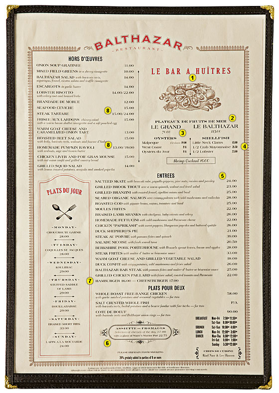
Puzzles, anchors, stars, and plowhorses; those are a few of the terms consultants now use when assembling a menu (which is as much an advertisement as anything else). “A star is a popular, high-profit item—in other words, an item for which customers are willing to pay a good deal more than it costs to make,” Poundstone explains. “A puzzle is high-profit but unpopular; a plowhorse is the opposite, popular yet unprofitable. Consultants try to turn puzzles into stars, nudge customers away from plowhorses, and convince everyone that the prices on the menu are more reasonable than they look.” Poundstone uses Balthazar’s menu to illustrate these ideas.
1. The Upper Right-Hand Corner
That’s the prime spot where diners’ eyes automatically go first. Balthazar uses it to highlight a tasteful, expensive pile of seafood. Generally, pictures of food are powerful motivators but also menu taboos—mostly because they’re used extensively in lowbrow chains like Chili’s and Applebee’s. This illustration “is as far as a restaurant of this caliber can go, and it’s used to draw attention to two of the most expensive orders,” Poundstone says.
2. The Anchor
The main role of that $115 platter—the only three-digit thing on the menu—is to make everything else near it look like a relative bargain, Poundstone says.
3. Right Next Door
At a mere $70, the smaller seafood platter next to Le Balthazar seems like a deal, though there’s no sense of how much food you’re getting. It’s an indefinite comparison that also feels like an indulgence—a win-win for the restaurant.
4. In The Vicinity
The restaurant’s high-profit dishes tend to cluster near the anchor. Here, it’s more seafood at prices that seem comparatively modest.
5. Columns Are Killers
According to Brandon O’Dell, one of the consultants Poundstone quotes in Priceless, it’s a big mistake to list prices in a straight column. “Customers will go down and choose from the cheapest items,” he says. At least the Balthazar menu doesn’t use leader dots to connect the dish to the price; that draws the diner’s gaze right to the numbers. Consultant Gregg Rapp tells clients to “omit dollar signs, decimal points, and cents … It’s not that customers can’t check prices, but most will follow whatever subtle cues are provided.”
6. The Benefit Of Boxes
“A box draws attention and, usually, orders,” Poundstone says. “A really fancy box is better yet. The fromages at the bottom of the menu are probably high-profit puzzles.”
7. Menu Siberia
That’s where low-margin dishes that the regulars like end up. The examples here are the easy-to-miss (and relatively inexpensive) burgers.
8. Bracketing
A regular trick, it’s when the same dish comes in different sizes. Here, that’s done with steak tartare and ravioli—but because “you never know the portion size, you’re encouraged to trade up,” Poundstone says. “Usually the smaller size is perfectly adequate.”
Join over 320,000 readers. Get a free weekly update via email here.
Related posts:
New Neuroscience Reveals 4 Rituals That Will Make You Happy
New Harvard Research Reveals A Fun Way To Be More Successful
How To Get People To Like You: 7 Ways From An FBI Behavior Expert


