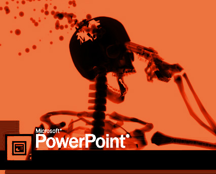
Does PowerPoint make you stupid?
.
The head of American and NATO forces in Afghanistan has called it the Army’s principal enemy.
An argument has been made that PowerPoint’s default style obscured essential information at NASA and may have been responsible for the 2003 space shuttle Columbia accident.
It’s been estimated that by cutting down on the time given to meetings and spent creating PowerPoint major companies could save $47 million dollars a year.
“PowerPoint makes us stupid.” This is what Marine General James N. Mattis declared at a military conference (in a speech given without PowerPoint) in North Carolina in April 2010. The article in the New York Times reporting the remark revealed the pervasive role the software was playing in the American armed forces. It reached the point that the then head of American and NATO forces in Afghanistan, General Stanley A. McChrystal, accused PowerPoint of having become the U.S. Army’s principal enemy, nothing less.
And:
…this American expert in graphic communication demolishes the software, relying in particular on NASA documents used during the space shuttle Columbia accident in 2003. Dissecting a single slide, Tufte takes apart the graphic and discursive mechanisms that helped to obscure essential information that could have sounded the alarm about the possibility of an accident. A few months later, the investigating committee’s report took harshly critical note on NASA’s recurrent use of PowerPoint and its glaring inadequacy in dealing with this kind of information.
Tufte uses other, less tragic examples that nonetheless confirm the risks of abuse or misuse of this kind of prop:
PowerPoint’s convenience for some presenters is costly to the content and the audience. These costs arise from the cognitive style characteristic of the standard default PP presentation: foreshortening of evidence and thoughts, low spatial resolution, an intensely hierarchical single-path structure as the model for organizing every type of content, breaking up narratives and data into slides and minimal fragments, rapid temporal sequencing of thin information rather than focused spatial analysis, conspicuous chartjunk and PP Phluff, branding of slides with logotypes, a preoccupation with format not content, incompetent design for data graphics and tables, and a smirky commercialism that turns information into a sales pitch and presenters into marketeers.
And:
In 2006, an expert even amused himself by calculating the savings a bank like Citigroup, then one of the largest in the world, would make by cutting down the time given to meetings and the preparation of bad PowerPoint presentations. He came up with $47 million.
My compilation post on giving an awesome presentation is here. The best books on presenting are here and here.
Related posts:
10 tips for giving a world class presentation
25 research-based ways to increase your intelligence
What quality can make you more convincing in a presentation or negotiation?


